Metropolitan Surgical Assistants Branding
The step-by-step process I went through with Metropolitan Surgical Assistants to design their brand.
This project is a new brand. Below you can read along through the process with my client and I!
Starting out with a branding project means getting to know the client and finding out what their needs are. I start this process with a discussion of what they have conceived the company to be and what it is not.
This particular company had previously started another company and this one (Metro) is a DBA. With that in mind, we chose to use almost the same typefaces and a color palette that would not clash if two business cards were handed out together.
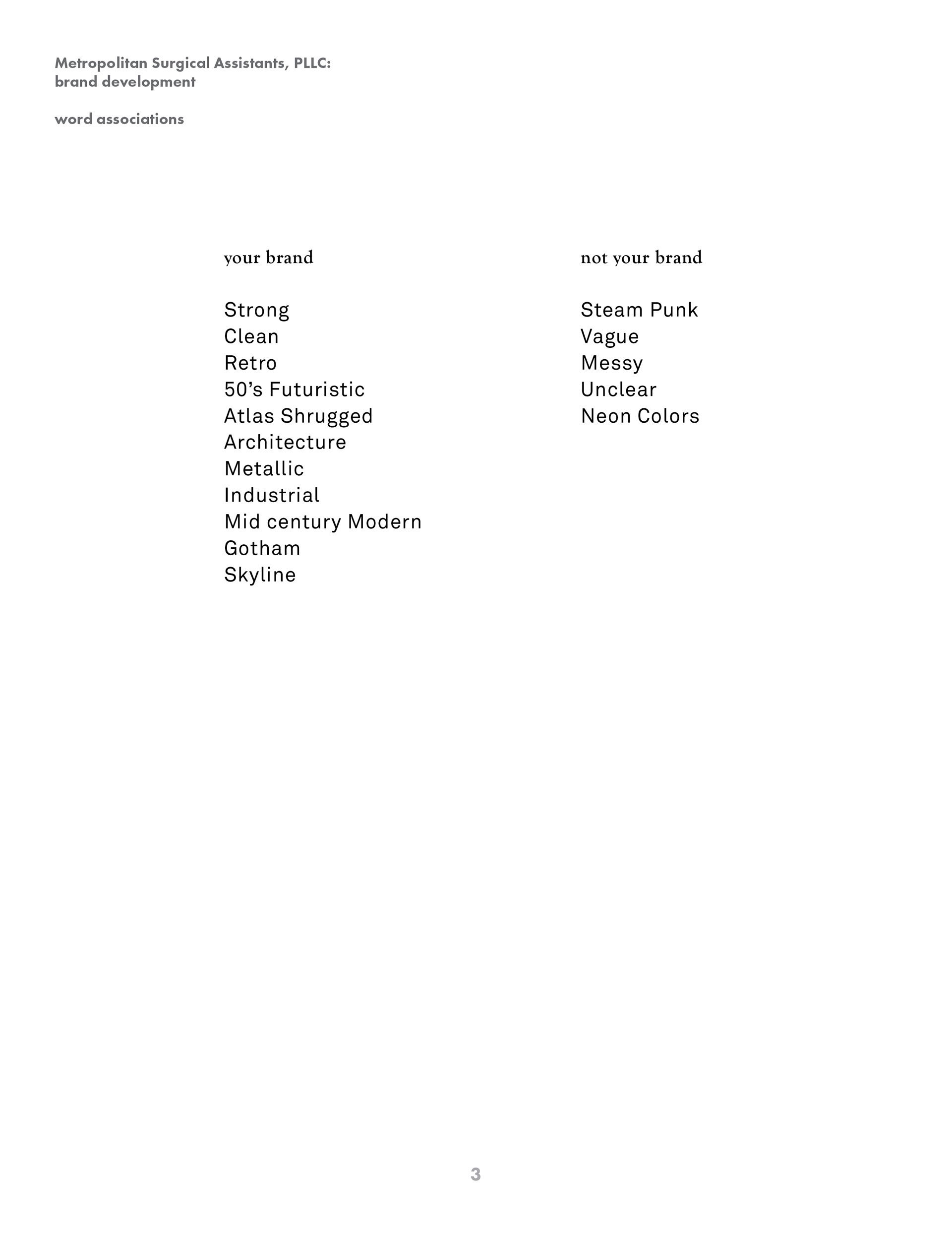
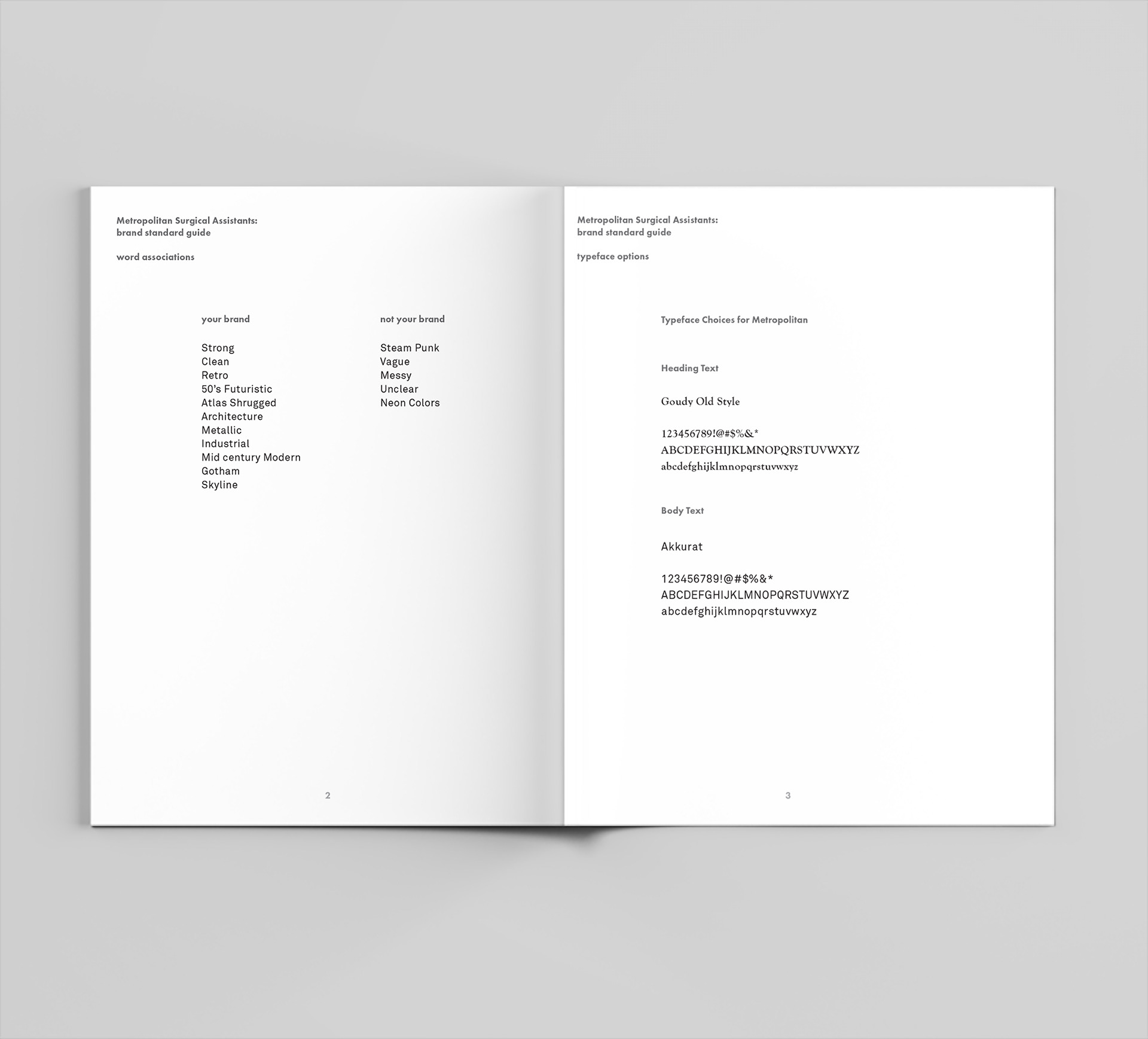
I learned from my clients that they really wanted to make a visual mark on their client's minds. Their field of work is not known to have a plethora of logos, most of them being a visual representation of a human body or part. It is the medical field after all. They also wanted to place themselves in Arizona. Like many of us, they are proud transplants to our state.
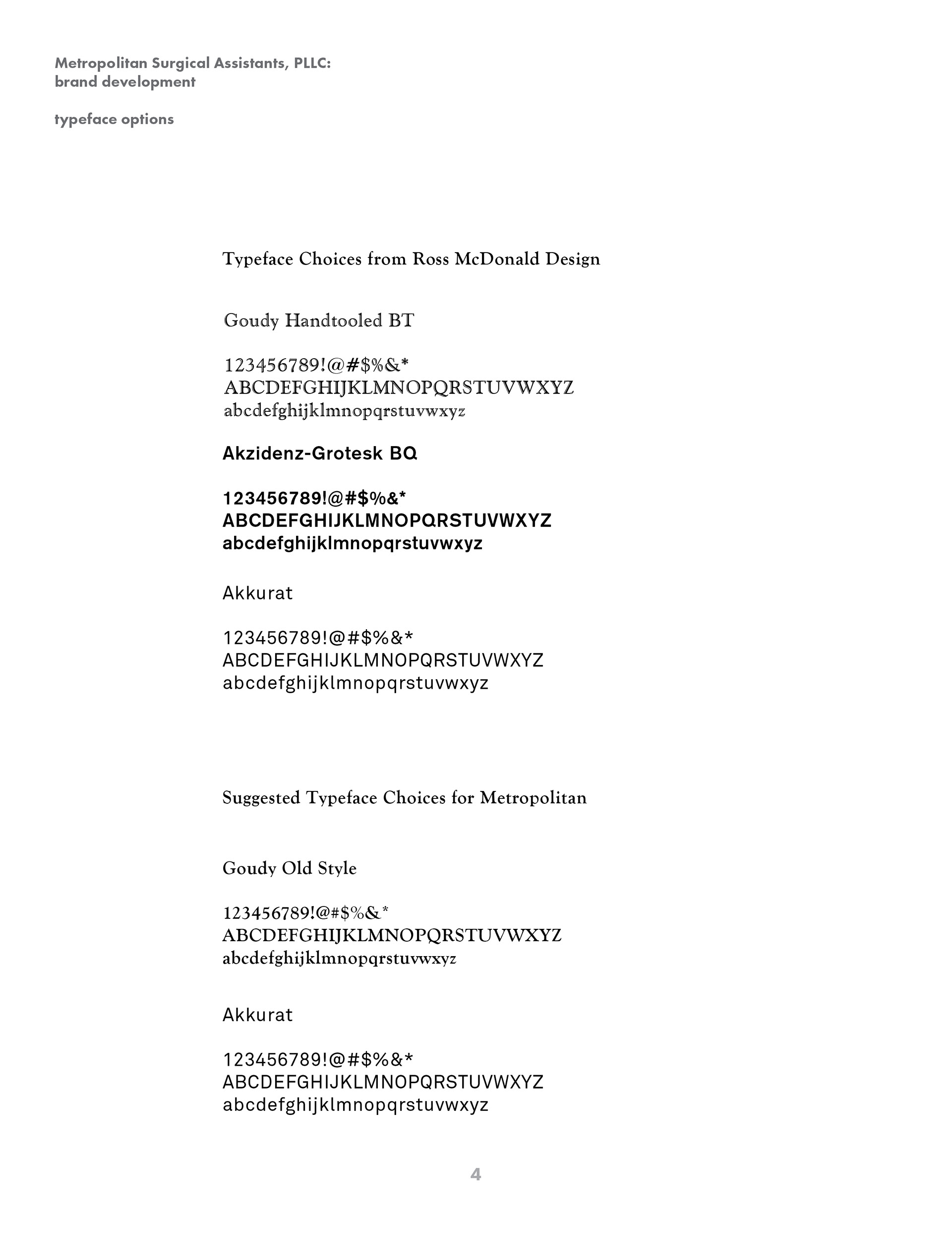
With typeface Goudy Old Style, I started to typeset the company name.
Next, I found inspiration for what I think the client wants.

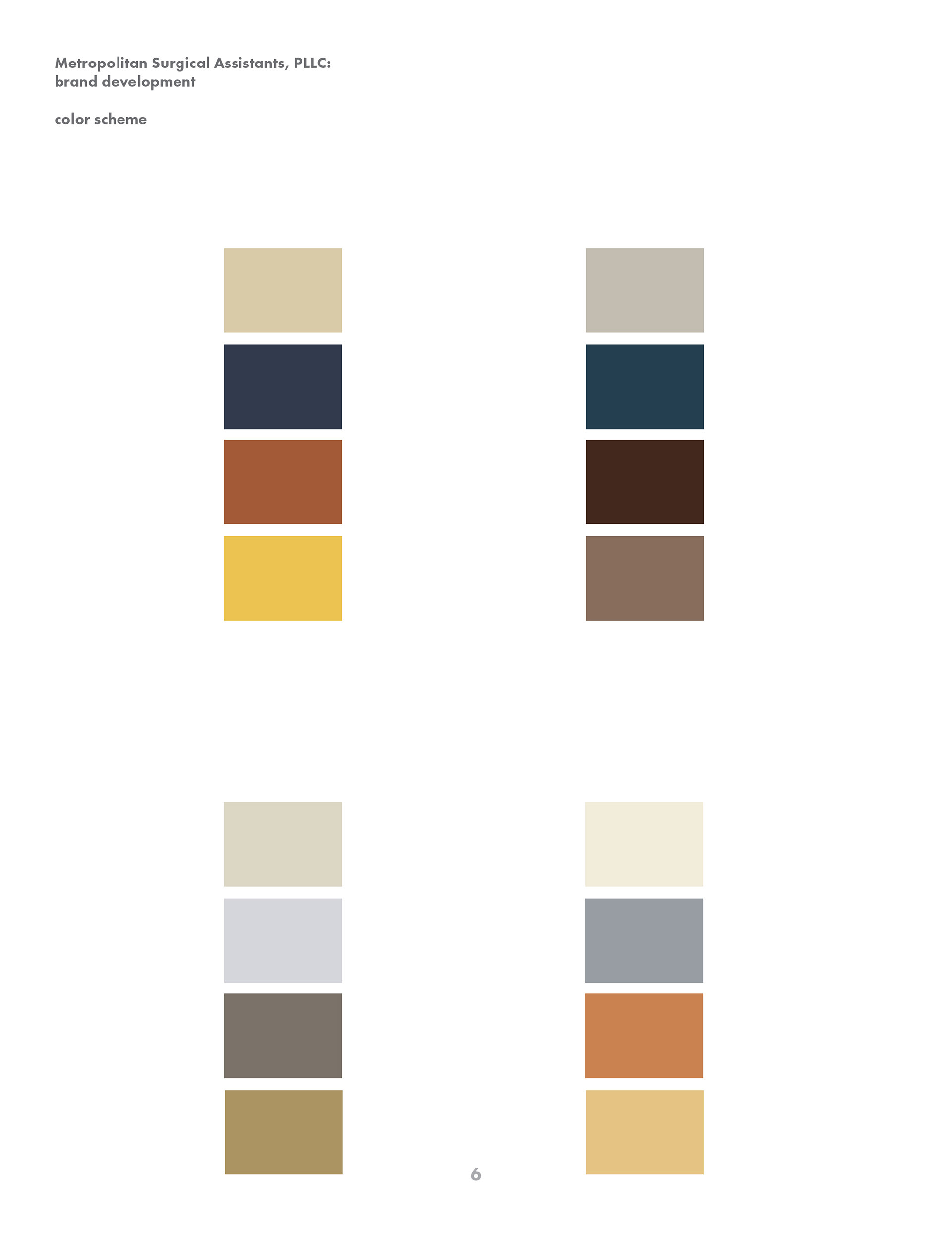
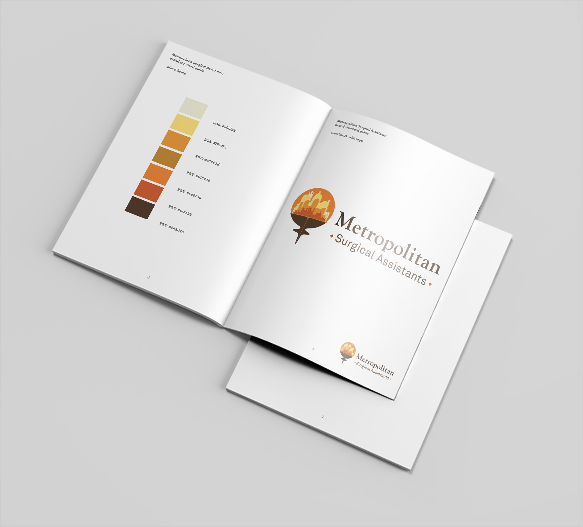
From the inspiration and conversation, I chose a couple of color palettes. This is when the second meeting happens with my client and I. They can give input now to make sure I am steering in the right direct.
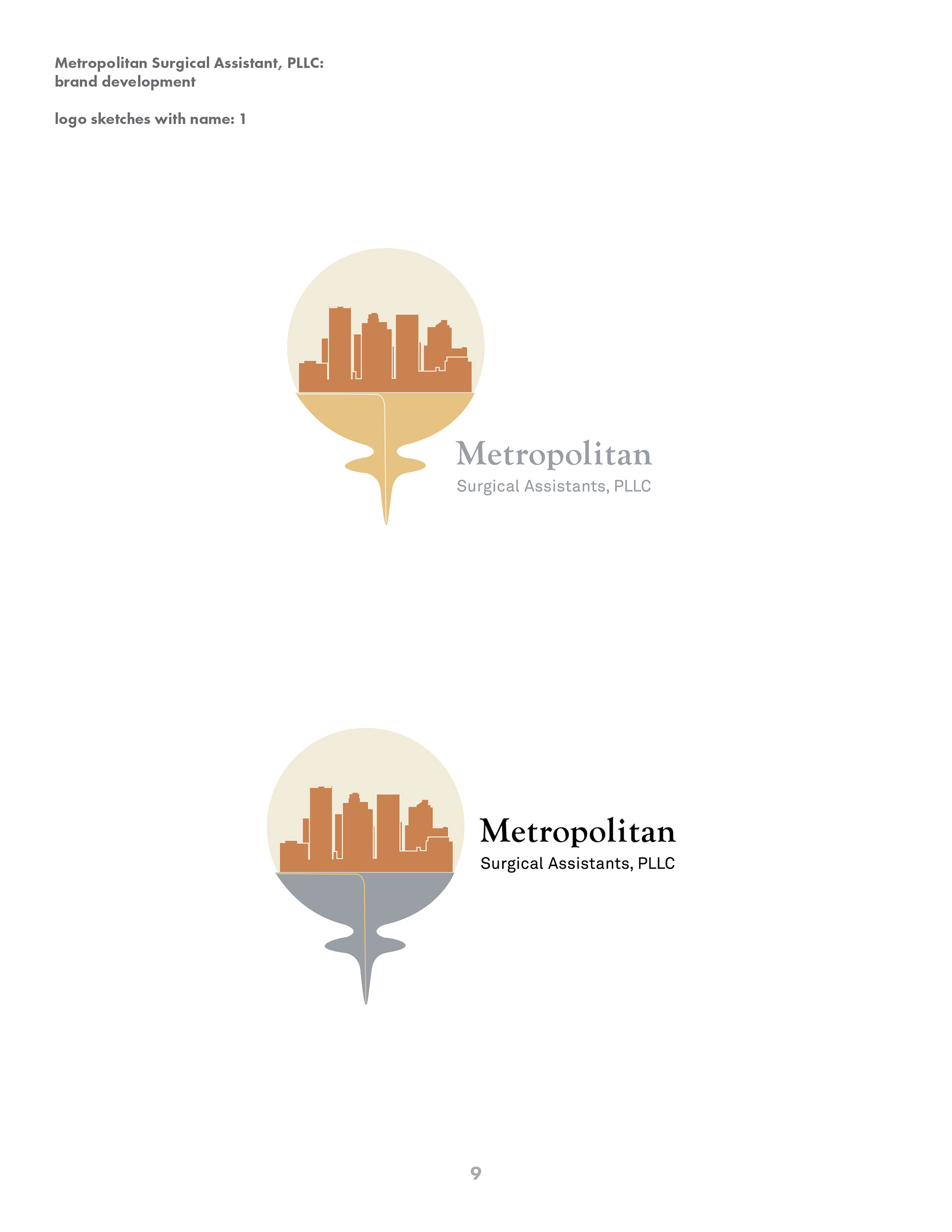
Some early sketches of 2 directions.

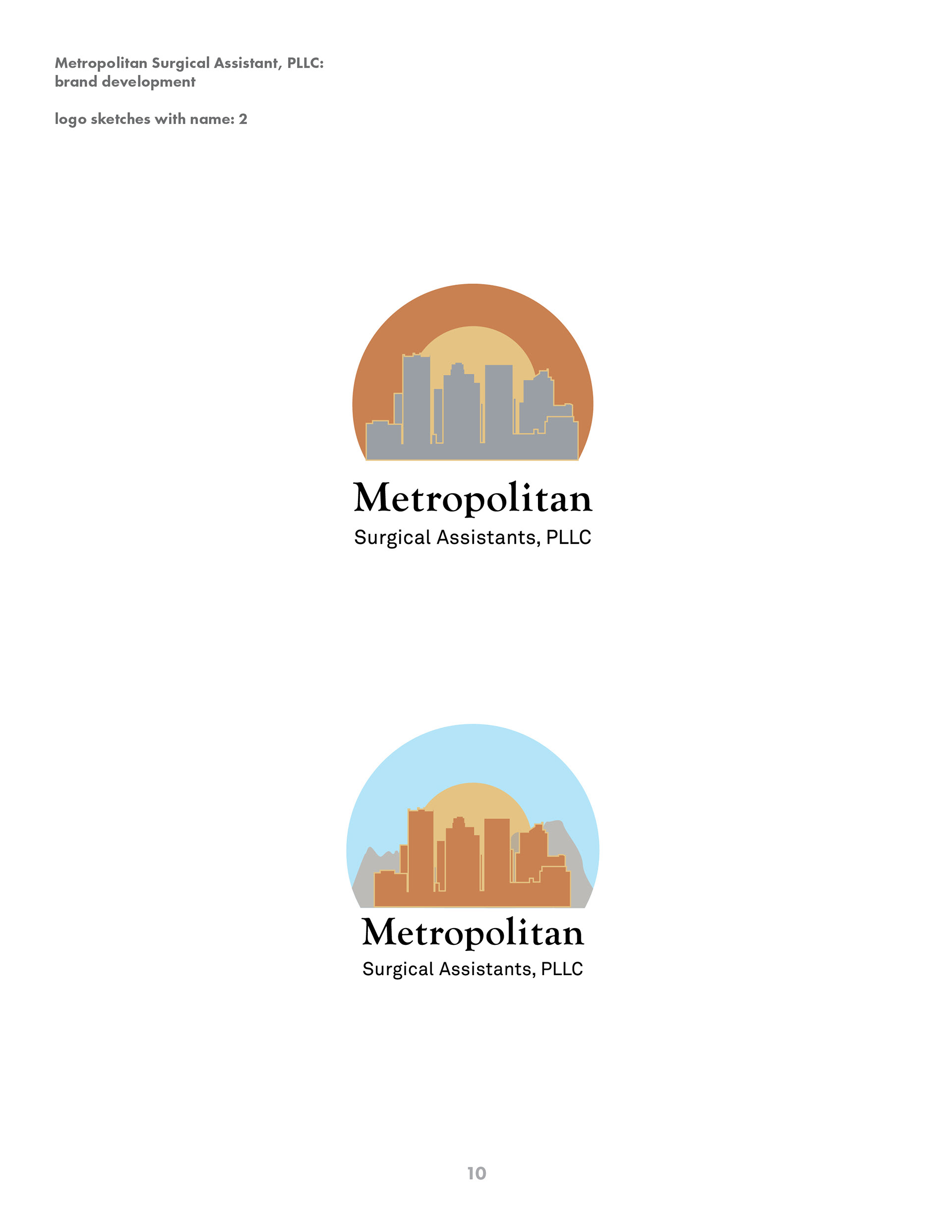
Logo and word mark positioning with alternative color options.
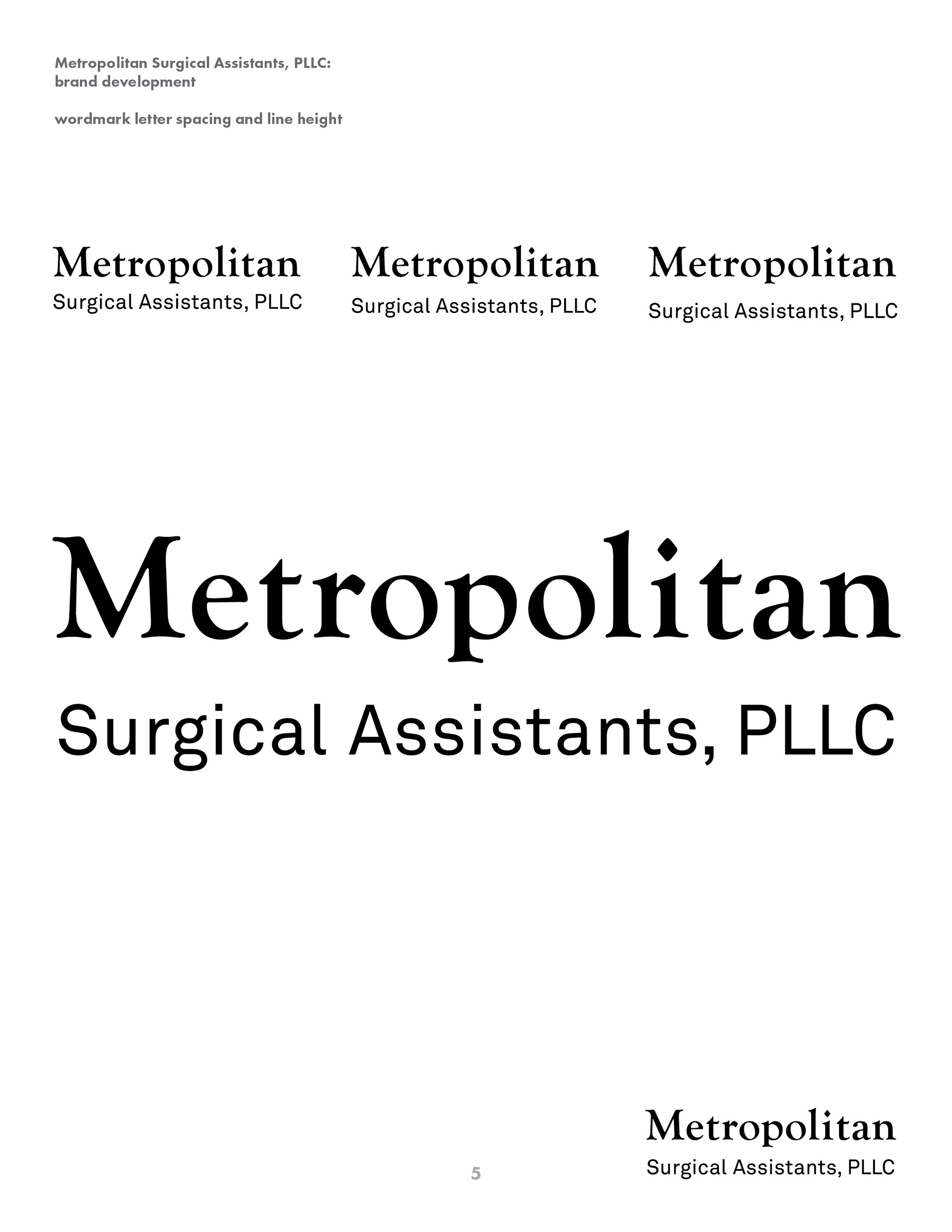
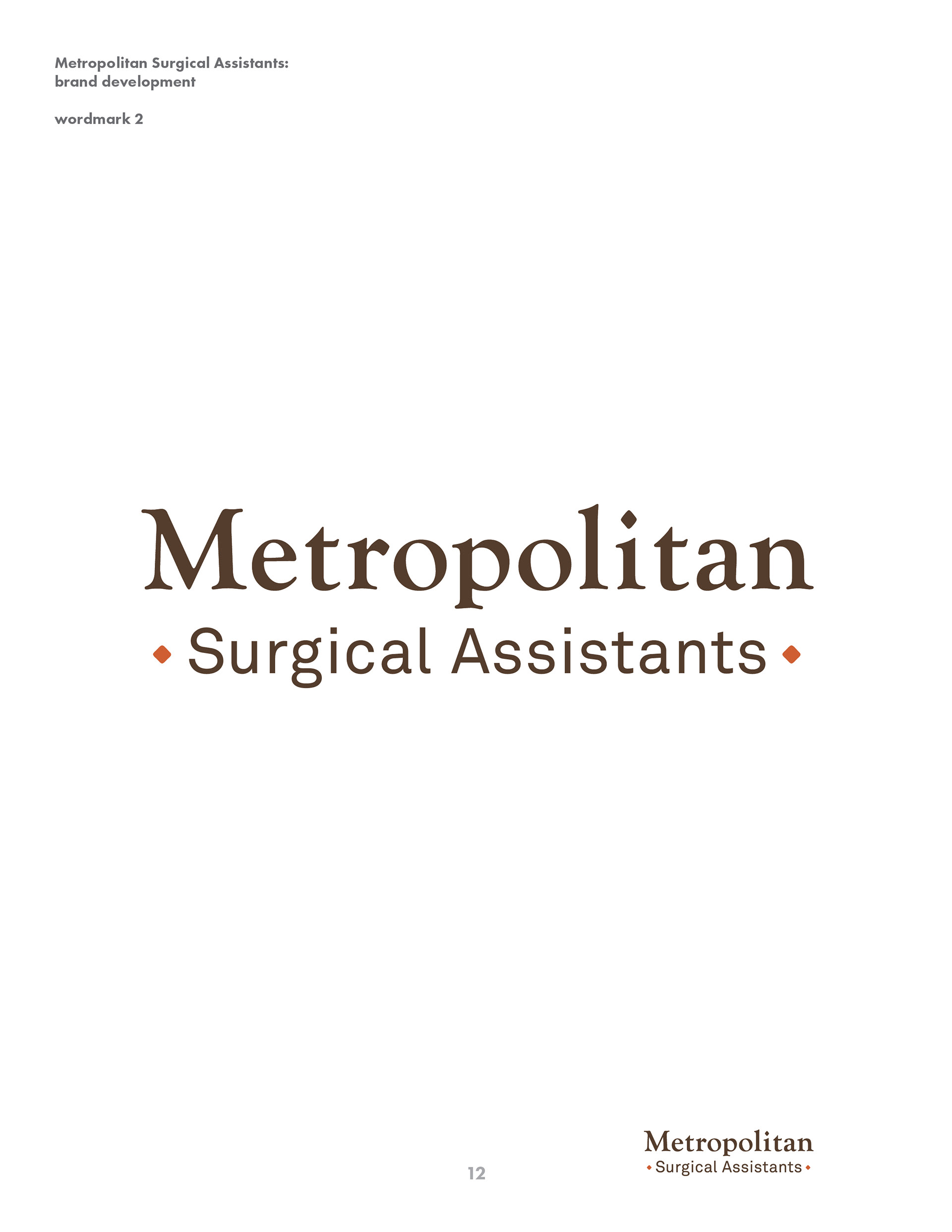
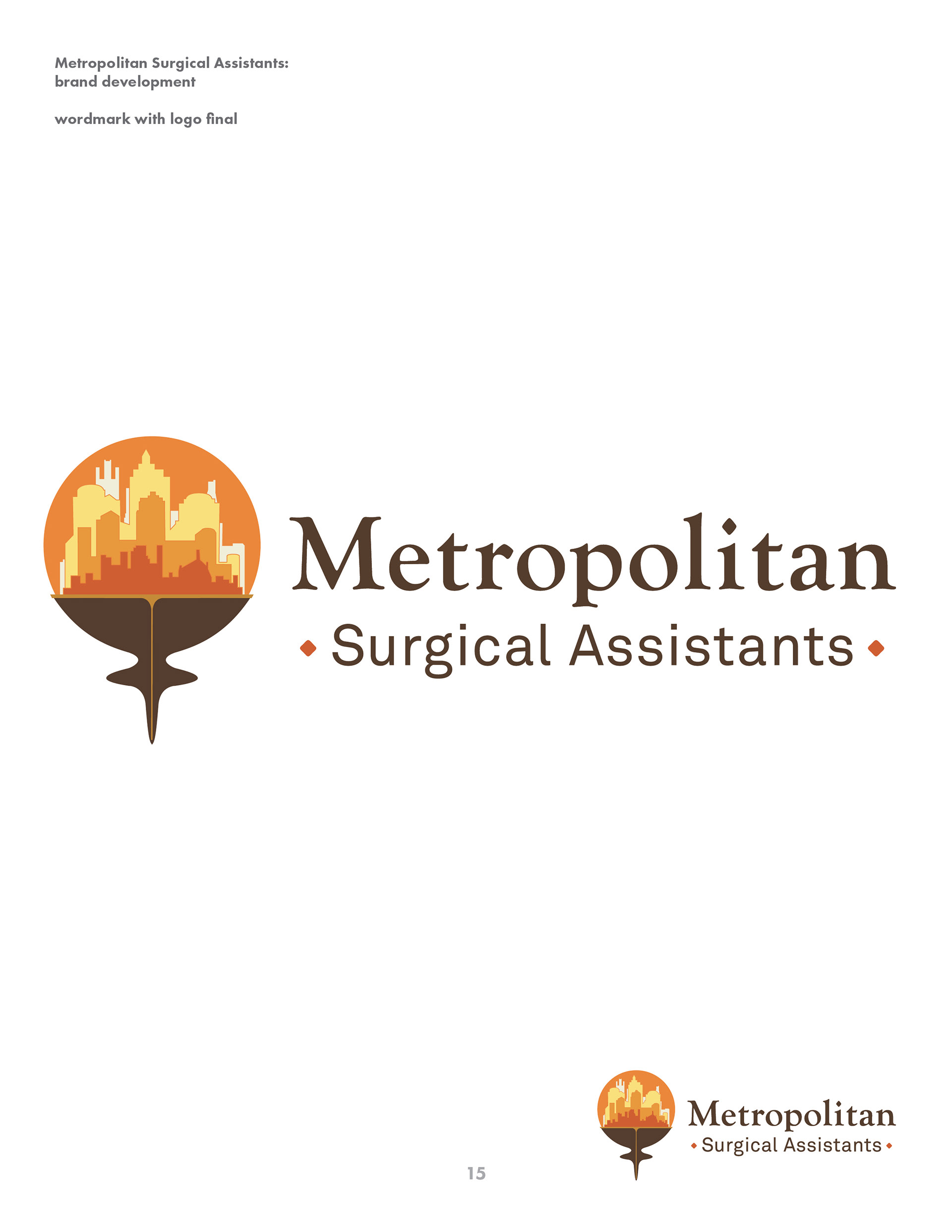
Here we found that we should not have the "PLLC" in the logo so instead, I used a dash and a tittle (the superscript dot that goes above an "i" or "j") to give character to the company name for instances of only using the title. Employing alternative characters from a typeface that has such personality, is almost always a sure way to match the aesthetics.

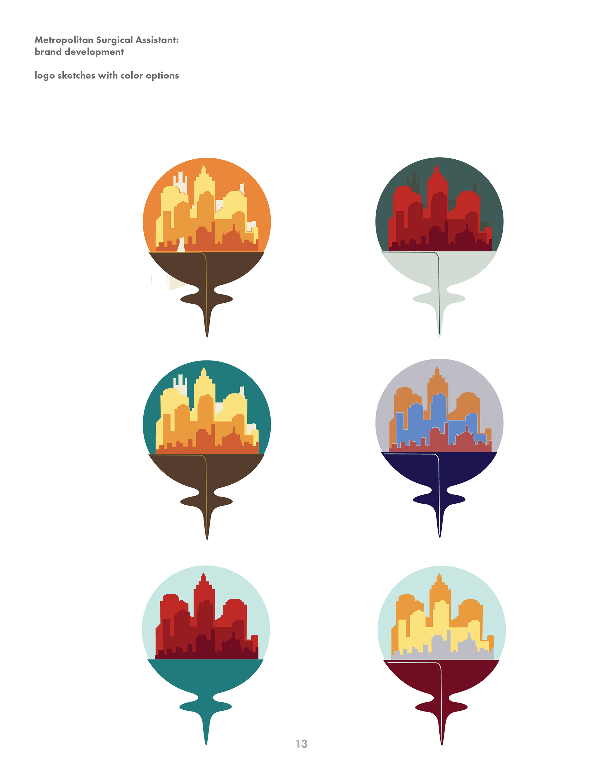
Email meetings continue with ideas about the logo. Here I show further evolution with several color options.
With the final colors chosen, the logo and word mark are placed next to one another again.
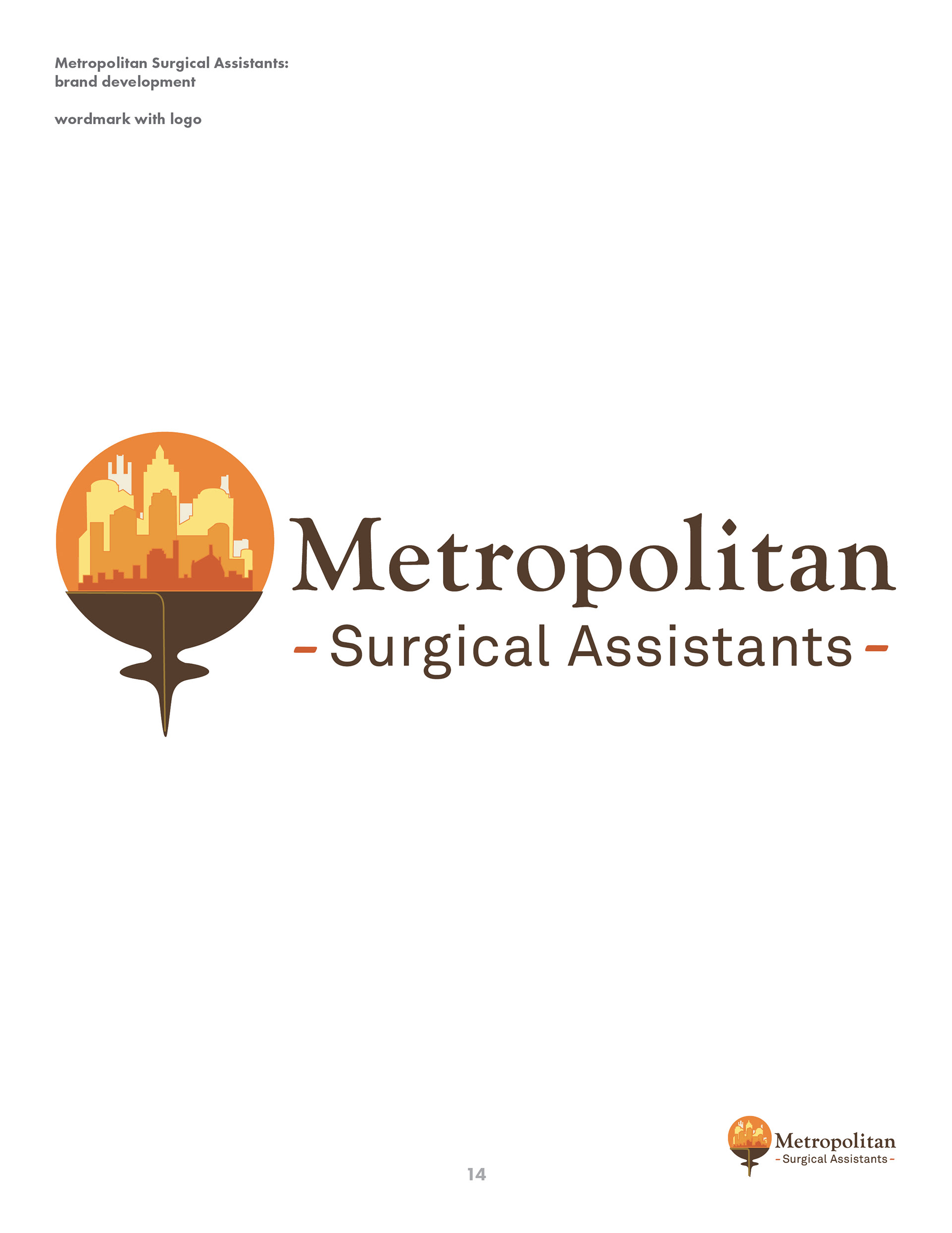
This is the final logo for Metro. They chose to be very "Arizona" with a futuristic skyline.
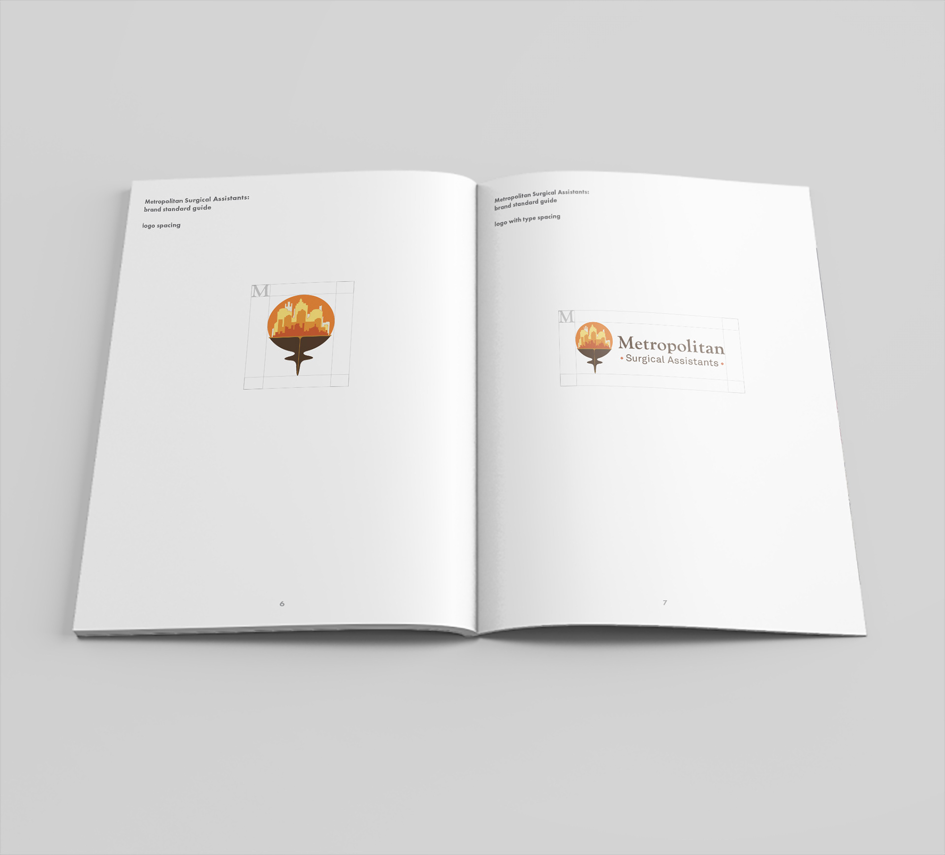
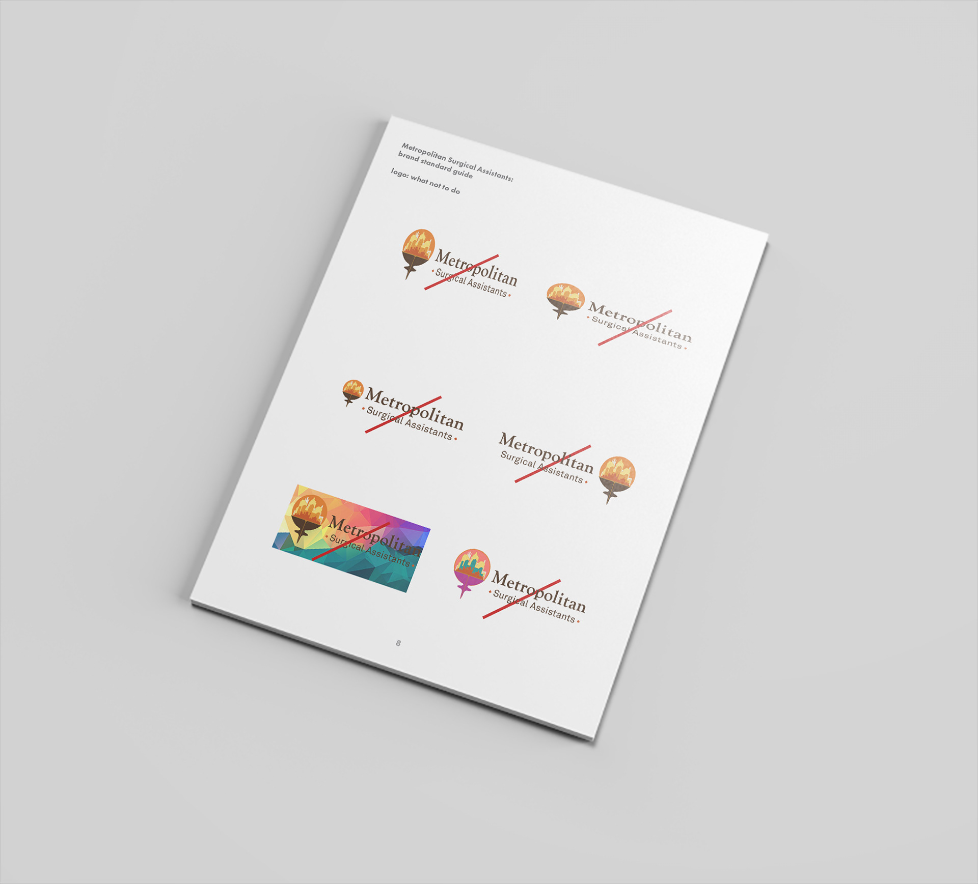
Next I design a short style guide to explain the brand to other designers.
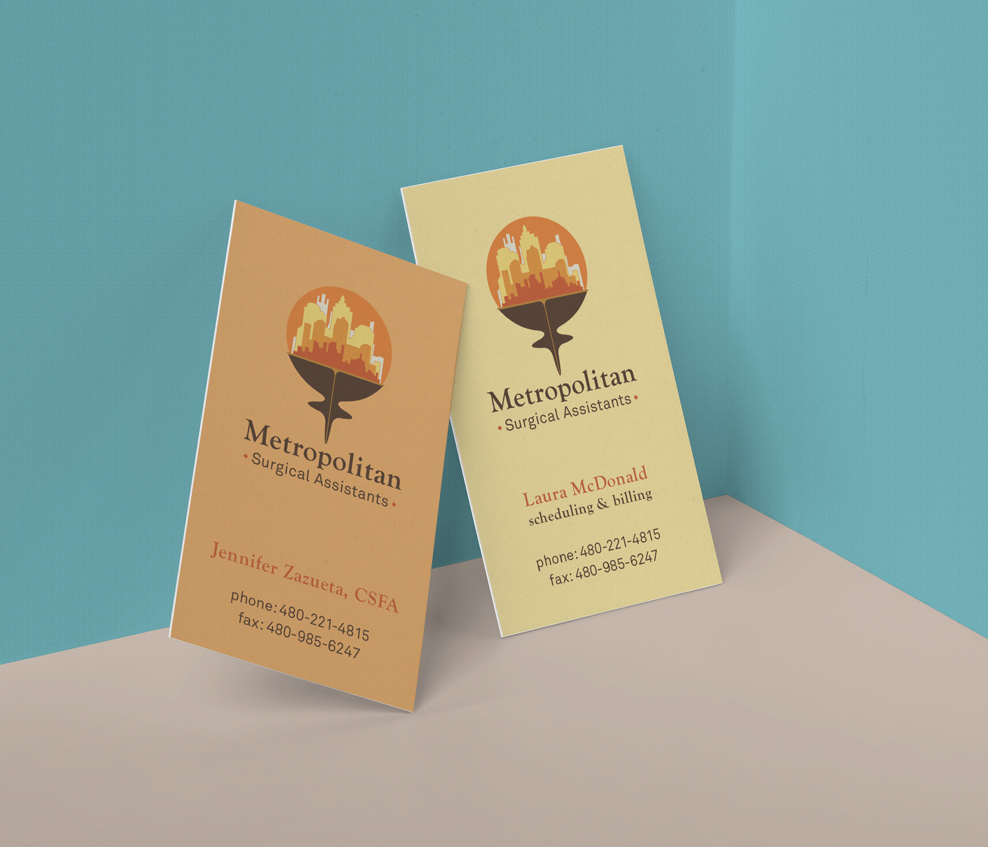
Business cards: Before I designed the business cards, I had another meeting with the client to discuss the who, what, where, why, and when about the use of them. I learned that these cards are given out for appointments and billing only. We chose to let the back side blank for space to write on. They wanted to differentiate the Billing and Scheduling person from the actual Surgical Assistants.
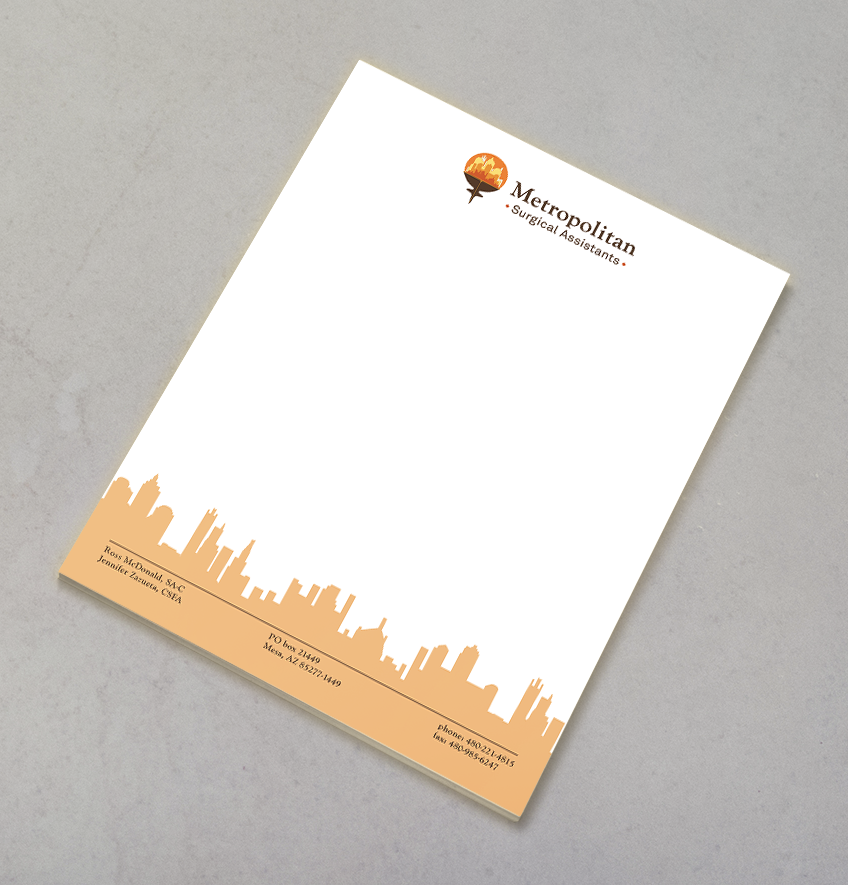
The company wanted to continue to stand out from their competition. I designed something that would work well in color but also in black and white as the letterhead would often be faxed.
Thanks for looking!
Lori Hollins