Type Specimens: The Kingdom
This project was made to get to know these four typefaces. I chose these four to work together in a family for the next year.
A new graphic designer has to learn about color theory, composition and the dreaded concept of typeface pairings. Combining type is a challenge when you are picking two typefaces, but I chose to pick four. I knew this was going to be a challenge, and I had to have a plan. I needed something bold and exciting to start out with. The type that was going to have the dominating presence among the others was to be crowned king. I then needed a typeface that was going to contrast but also compliment the king, which of course was to be the Queen. Finally, I needed to to pick two typefaces that agreed with the King and Queen but had a lesser presence, their children, the Prince and Princess. As an artist, I wanted this monarchy to be loud and allow for many experimental opportunities.
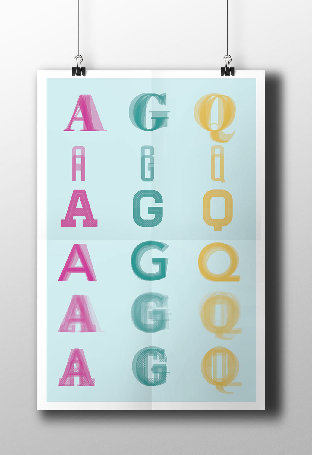
Homestead became that typeface my others looked to. This typeface gave me a creative and artsy feeling most typefaces do not. Homestead comes in multiple layers, giving the designer the option of using as many or few as their artistic direction warrants. This is unique to Homestead and one of the biggest draws to me as a designer. Luke Lisi designed this typeface. He says it was “Inspired by our desire and need to explore. Always searching for a place to call home.”

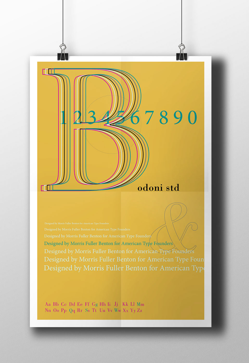
I chose Bodoni STD as the Queen. Bodoni STD was designed as a revival between 1907 and 1911. Described as a sturdy and mechanical transitional, Bodoni STD was designed with inspiration from Baskerville and Didot. The designer, Morris Fuller Benton was born in 1872 in Milwaukee, Wisconsin. After Benton trained as a mechanic and engineer, he joined the American Type Founders, and became the type designer.
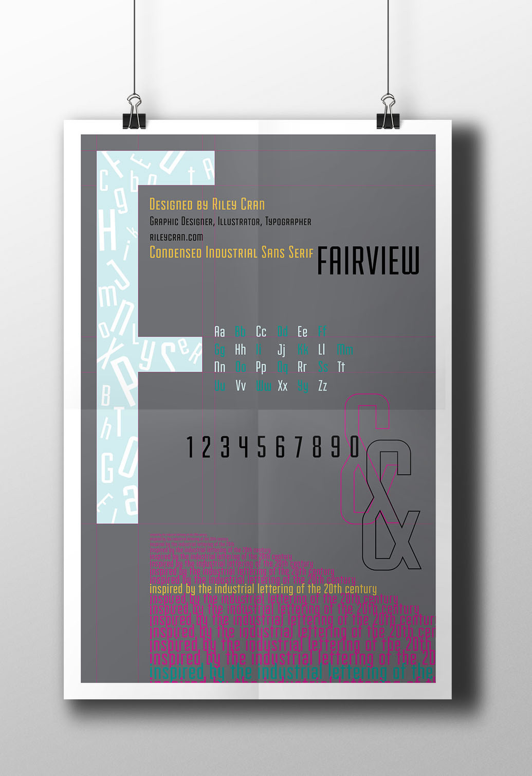
Fairview was chosen as the typeface for the Princess. I needed a sans serif typeface that compliment the King. Fairview was simple and contrasted Homestead in weight, width and complexity of texture. Riley Cran designed this typeface. He described it as a condensed, industrial sans serif. It is also somewhat geometrical which matched the King Homestead. It is much thinner than so it contrasted it well.
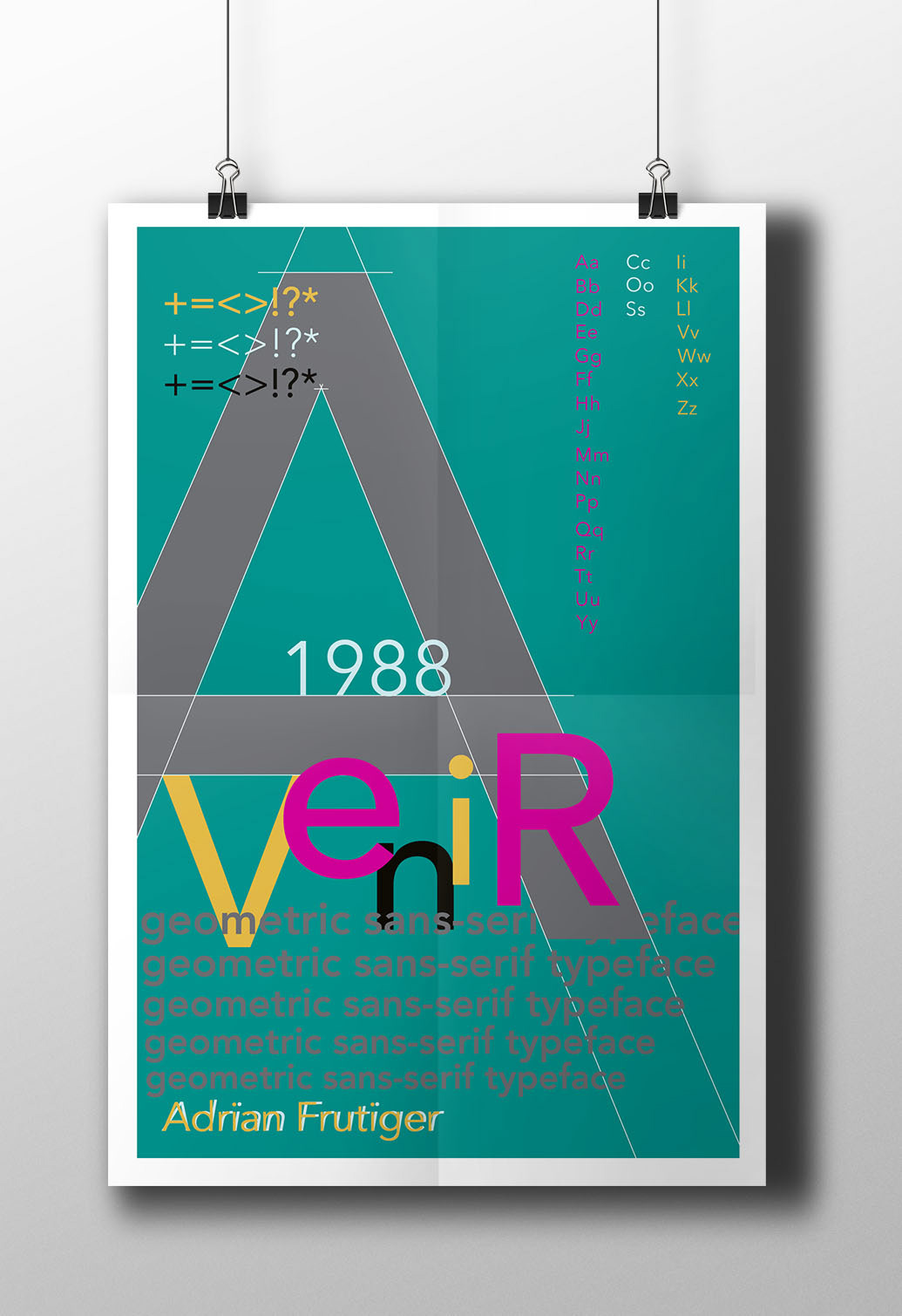
Avenir, which is French for ‘future,’ was my next choice. As the Prince, he needs to be looking towards the future. Avenir was designed by Adrian Frutiger, in 1998. It was released by Linotype-Hell AG and was based on typefaces Futura and Univers. Avenir is a geometric sans serif, but it has a human touch to it, which is what my typeface options needed and why Frutiger redesigned Futura. The different fonts have similar weights, designed for a specific purpose. Interestingly enough, Avenir has no Italic style and the ‘o’ is not a perfect circle. The Prince will not always follow in his father’s footsteps. Originally, I had chosen Futura for the Prince typeface. It is interesting to learn how similar they are.
My typefaces were made during completely different time periods and locations, but this reflects my influences and what I am interested in. I plan to use these typefaces together in the same poster and show how their layered time periods can work together. Before this process started, type was important to me but not fun or exhilarating. As the process unfolded, the subtle nuances in each letter started to become more apparent. I could tell the difference between my typefaces after making type specimen after type specimen. The beginning of this process was still rough for me, but has become rewarding.